Playground
MediaFrame
media
container
Low-level media container for images, video, and gradient backgrounds
Owns radius, overflow, aspect ratio, overlay presets, and content positioning
Building block for MediaCard and complex multi-layer media compositions
import { MediaFrame } from "@everydayos/ui";Usage
Photo with bottom-fade overlay and positioned content
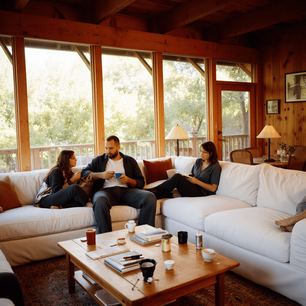
Climate System
Designed for how you live
A climate system that fits your home.
API
radiussmnonesmmdlgxl2xl
defaultpreferredrare
overlaynonenonetopFadebottomFadedarkVignettelightGlassbottomGlass
defaultpreferredrare
aspectvideo4/33/25/41/116/921/9114/5519/253/42/34/543/5016/18herotall
defaultpreferredrare
contentPositioncentercenterleft-middleright-middletop-lefttop-centertop-rightbottom-leftbottom-centerbottom-right
defaultpreferredrare
| Prop | Type | Default |
|---|---|---|
contentPadding | boolean | true |
media | React.ReactNode | — |
className | string | — |
children | React.ReactNode | — |
splitOpacityLayers | boolean | false |
Examples
Content Positions
Same image with different contentPosition values

Outdoor
Bottom left

Front view

Step 4
Top left
Glass Pills on Image
Floating glass pill controls over product imagery
<MediaFrame
  aspect="4/3"
  radius="sm"
  contentPosition="center"
  media={<Image src="/product.jpg" fill className="object-cover" alt="" />}
>
  <Stack spacing="sm">
    <GlassPill trailing={<ChevronDown className="size-3.5 opacity-60" />}>
      Apartment
    </GlassPill>
    <GlassPill trailing={<ChevronDown className="size-3.5 opacity-60" />}>
      3 rooms
    </GlassPill>
    <GlassPill trailing={<ChevronDown className="size-3.5 opacity-60" />}>
      4 people
    </GlassPill>
  </Stack>
</MediaFrame>Composition
Pairs well with
Layer
GlassPill
Stack
Heading
Text
When to avoid
- Need card-with-image — use MediaCard instead (less nesting)
- Simple image without overlay — use next/image directly
- No media content — use Surface instead
Patterns
Hero Section
Section
MediaFrame
Stack
Heading
Text
Button
Full-width hero with image or video background, large title, and CTA
<Section spacing="none">
  <MediaFrame
    overlay="bottomFade"
    contentPosition="bottom-left"
    className="h-screen"
    media={<Image src="/hero.jpg" fill className="object-cover" alt="" />}
  >
    <Stack spacing="lg" className="max-w-xl">
      <Heading as="h1" size="display" className="text-white">
        Hero Title
      </Heading>
      <Text size="l" className="text-white/90">
        Supporting description text.
      </Text>
      <Button size="xl">Get Started</Button>
    </Stack>
  </MediaFrame>
</Section>Media Split
Grid
MediaFrame
Stack
Heading
Text
Two-column layout with media on one side, content on the other
<Grid cols="2-asymmetric" gap="lg">
  <MediaFrame
    aspect="4/3"
    radius="sm"
    media={<Image src="/product.jpg" fill className="object-cover" alt="" />}
  />
  <Stack spacing="md" justify="center">
    <Heading as="h2" size="l">Feature Title</Heading>
    <Text variant="muted">Feature description paragraph.</Text>
    <Button className="w-fit">Learn More</Button>
  </Stack>
</Grid>Multi-Layer Composition
MediaFrame
Layer
GlassPill
Heading
MediaFrame with multiple Layer components for complex layouts
<MediaFrame
  aspect="video"
  radius="sm"
  contentPadding={false}
  media={<Image src="/room.jpg" fill className="object-cover" alt="" />}
>
  <Layer position="top-left">
    <Inline spacing="sm">
      <GlassPill size="sm" variant="dark">Live</GlassPill>
      <GlassPill size="sm">22°C</GlassPill>
    </Inline>
  </Layer>
  <Layer position="bottom-center" overlay="gradient-bottom">
    <Heading as="h3" size="m" className="text-white">Living Room</Heading>
  </Layer>
</MediaFrame>